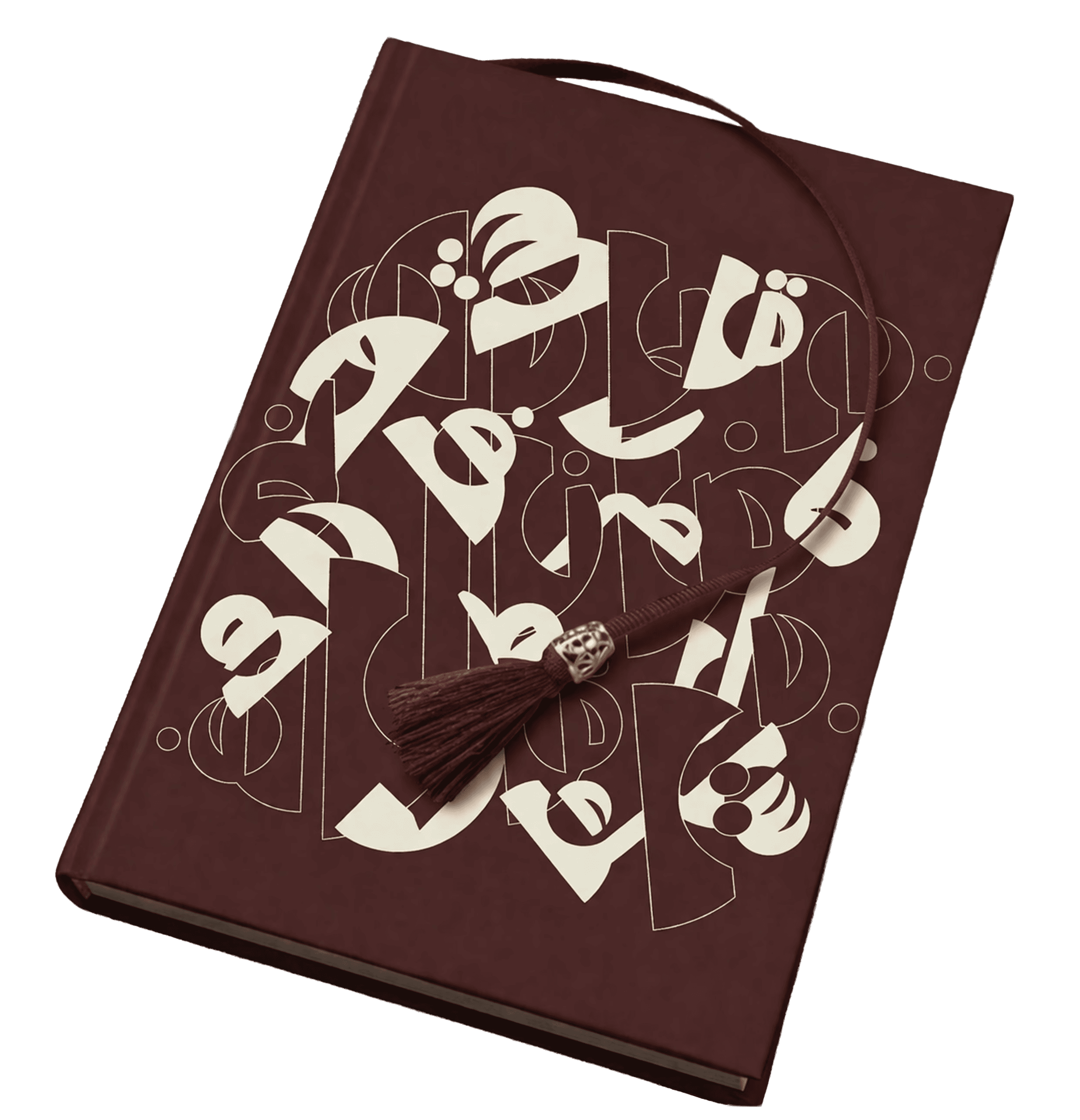
Calligraphy . Branding
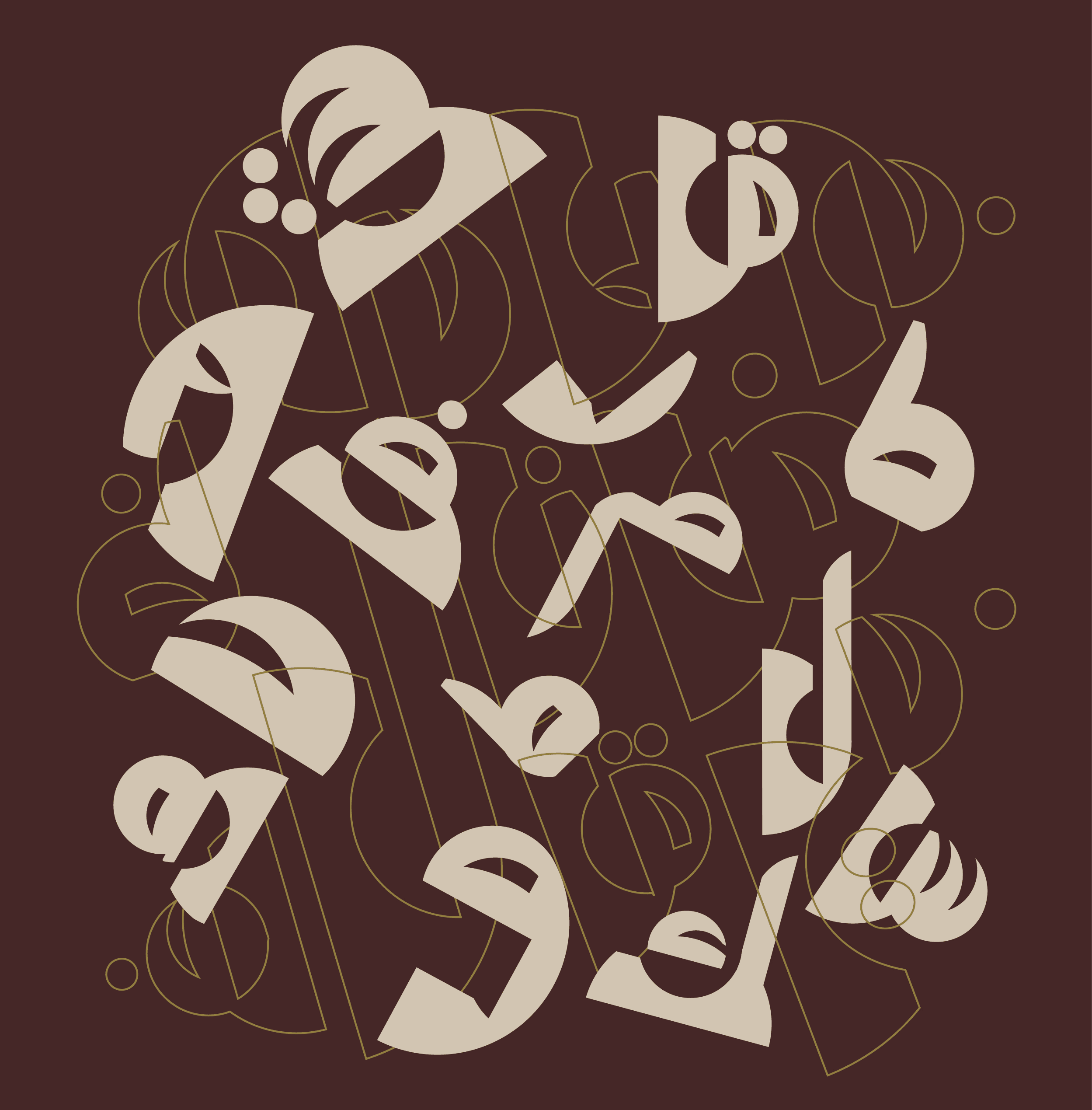
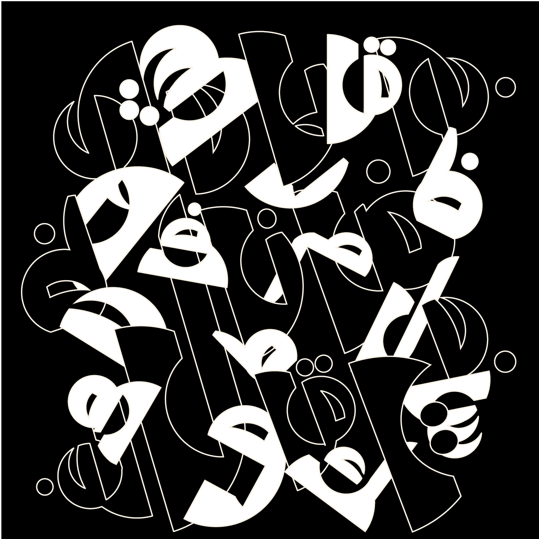
Project (طب) is an Arabic lettering and brand identity project that began as a purely personal experiment no brief, just curiosity about what Arabic letters could look like when treated as raw visual material.
The process started with a circle. I used it as a constraint and a canvas, sketching Arabic letterforms inside it repeatedly, cutting and carving shapes until the composition felt resolved

From there, the work became about weight, rhythm, and repetition testing how the forms held up at different scales, how they sat against each other, where the eye needed to rest and where it could get lost.


GOAL
Arabic calligraphy carries centuries of reverence and rule. What happens when you set that aside and treat the letters the way you'd treat any shape something to pull apart, rotate, and rebuild just to see what it becomes?